as a product designer at Orient Swiss, I have contributed to enhancing digital products over the years. Headquartered in Switzerland, ZOOD operates across fast-growing FinTech emerging markets, serving over 10 million users. The company offers a comprehensive ecosystem that integrates FinTech, E-commerce, and E-logistics, with lending at the core of its operations. Included are case studies that showcase how various UI/UX challenges were addressed to drive measurable improvements—such as increased conversion rates, the launch of new products and services, and enhanced user interface and experience.
The ZOOD lending platform allows users to access credit and make purchases in installments. Users can choose between different payment methods (e.g., x4, x6, x12) and channels (online, in-store, VIC). The credit limit details are accessible via a bottom sheet that users can open from their account page, homepage, and loyalty page, providing them with easy access to their financial information across different sections of the app.
In the previous version of the interface Users saw all payment options simultaneously, leading to information overload. It was unclear how the credit limit changed based on the selected payment method and channel.The layout did not provide an intuitive way to compare installment plans effectively. The presence of multi-colored bars increased visual complexity and made it harder to focus on essential information.


More users proceeded with purchases after understanding their available credit clearly, Users now have a more intuitive way to explore and select installment options, leading to a smoother decision-making process
As ZOOD’s fintech ecosystem continues to grow, user retention has become a critical focus. In response, I led the design of ZOOD’s Loyalty Program—a multi-tiered system aimed at rewarding consistent spending, encouraging activation, and deepening user engagement across the app. Beyond recognition, the program was strategically built to drive key behaviors: increasing credit limit activation rates, boosting spending through available limits, and improving users’ understanding of their financial capacity within the platform.
Starting with a reassuring blue for Entry, the icons gradually build to a refined, almost ethereal glow for Platinum, capturing the essence of each stage. This progression is intended to not only guide users through their journey but also inspire continued engagement, all while remaining seamlessly integrated into the app's design.


To maximize visibility and strengthen engagement, the loyalty tier widget was embedded across three high-traffic areas of the app: the homepage, account page, and the dedicated loyalty page. These placements ensure users regularly encounter their current tier and progress, reinforcing the value of the program throughout their journey.
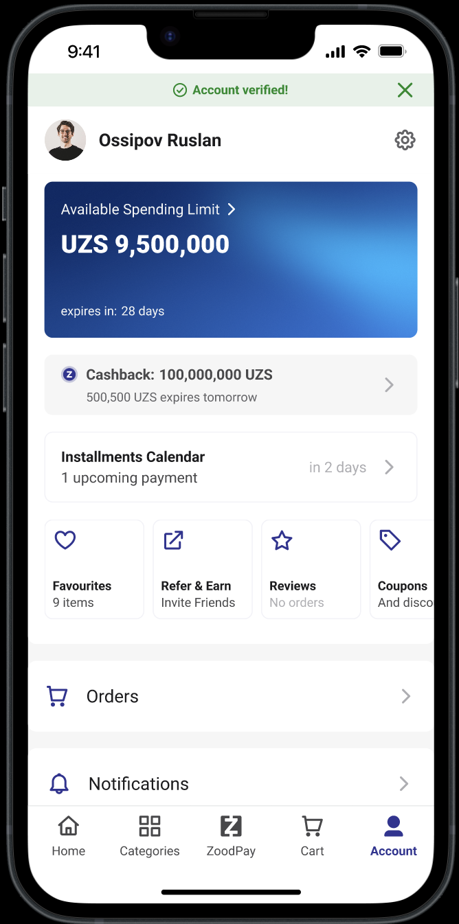

In addition to recognizing status, the widget is designed to drive action. It encourages users not only to make purchases using their available credit limit but also to activate and obtain their limit if they haven’t already. By making tier progression visible and aspirational, the interface turns these key behaviors into milestones that feel rewarding and motivating.


As the product designer behind the launch of the ZOOD Virtual Installments Card, I was responsible for defining and delivering the entire user experience—across card issuance, activation, and management flows—tailored to two very different markets.My work spanned from mapping cross-market user journeys and collaborating with developers to localizing flows for regulatory and behavioral differences between Pakistan and Uzbekistan.

The card had to be activated manually before each transaction. This friction, while necessary due to technical and regulatory constraints, posed a significant usability risk.
Our goal:How might we turn this mandatory step into a moment of user trust and control—rather than frustration?

Multiple variations of the tap to pay activation were tested. Winner? The simplest. While we were in awe of our two way toggle, after testing on a user group, it seemed that for our market the bottom sheet approach was the clearest.

