PROJECTS+ INFO

Case Study: Lyxa 2.0

TYPE OF WORK
UX DESIGN
CLIENT
LYXA AI
DATE
2025
CREDIT
ADAM KADRI (CTO)

INVOLVEMENT

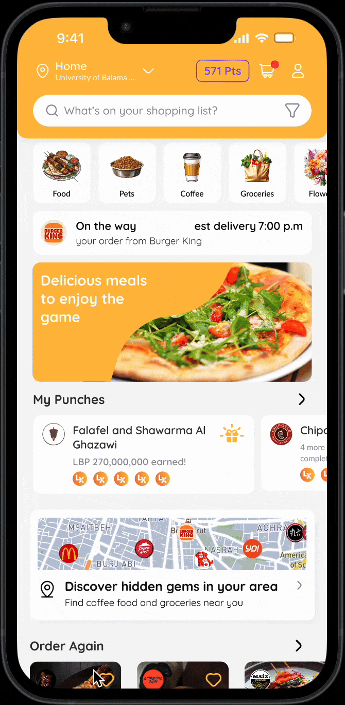
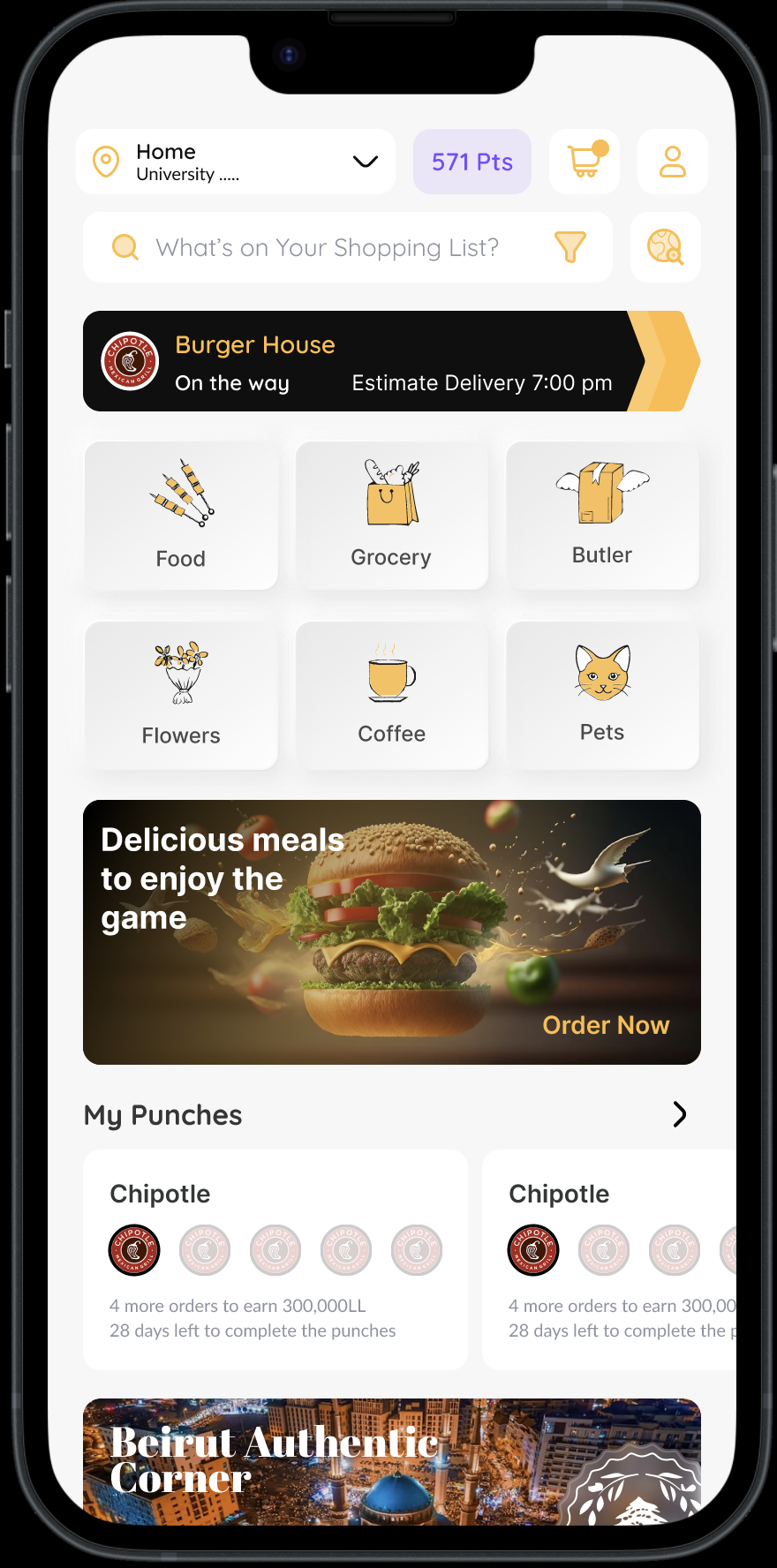
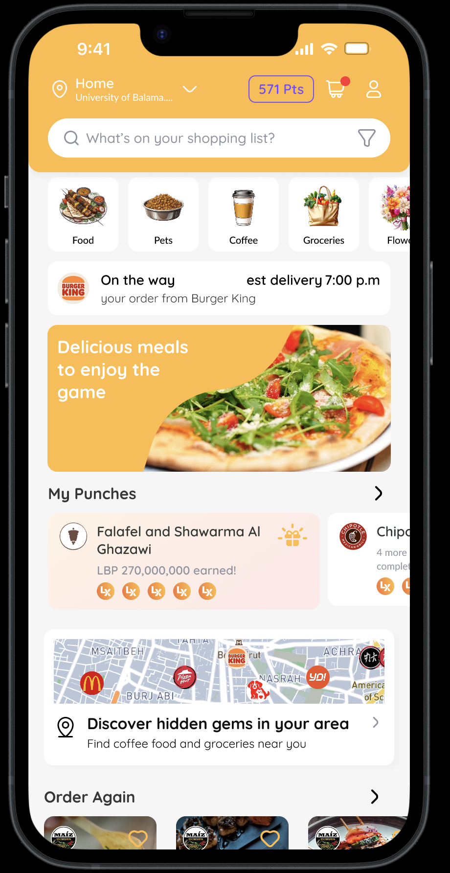
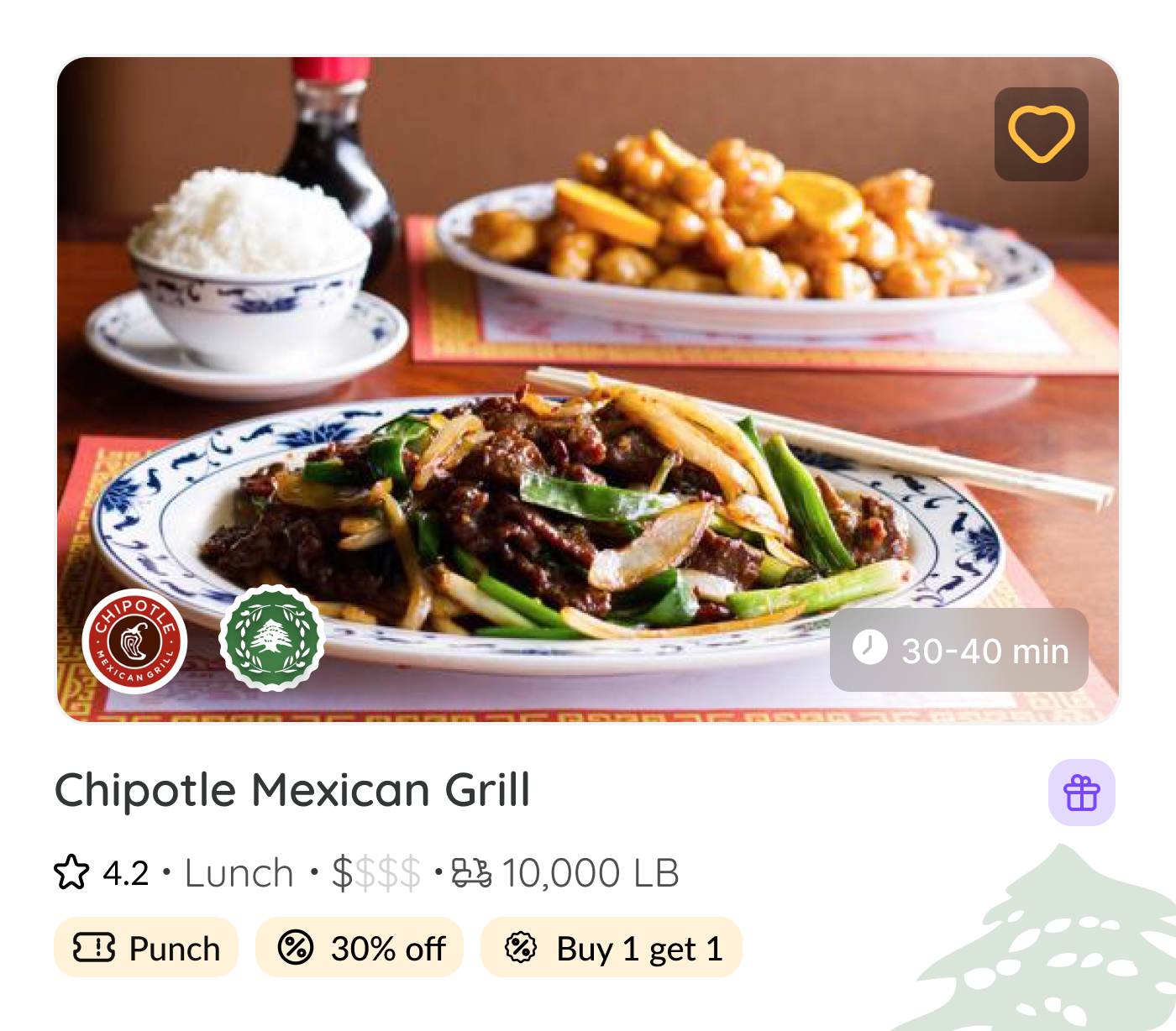
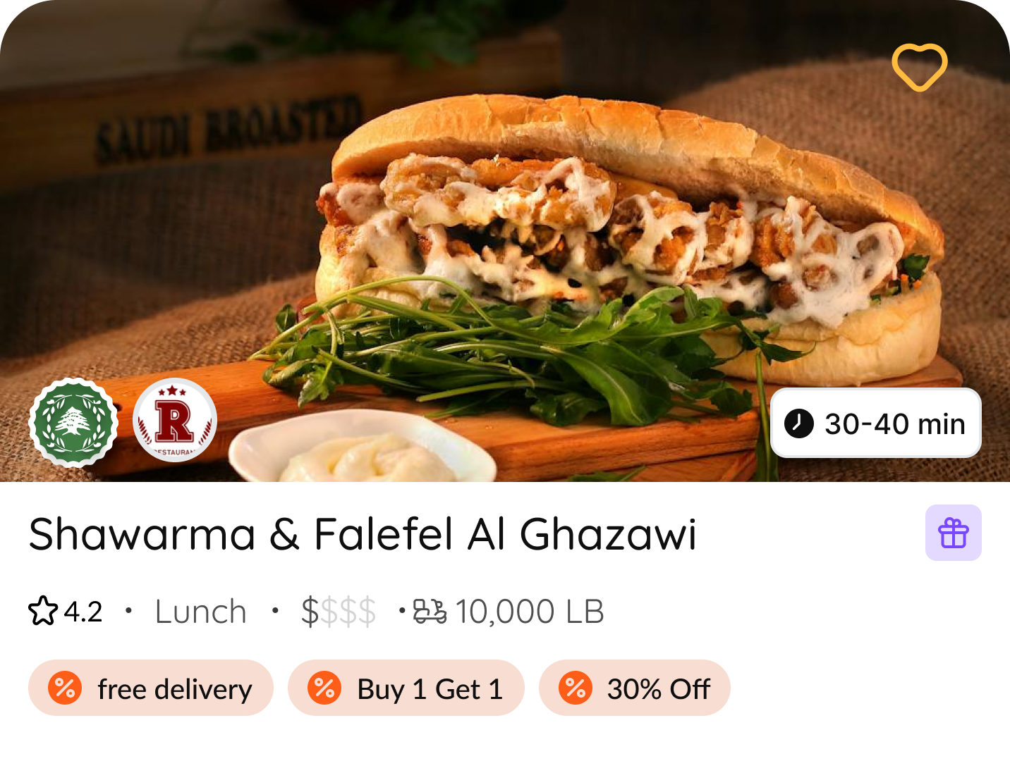
I was brought on board to refine the overall UI/UX of the LYXA app—a food delivery and digital butler service launched in Lebanon. My role involved elevating the visual language by implementing the new brand typeface and establishing a consistent typography system within the design system. I also contributed to the redesign of several key user flows, including the onboarding experience, the homepage, and the restaurant detail page, with a focus on improving usability, clarity, and visual coherence.

1. Homepage redesign

The homepage underwent a comprehensive visual overhaul aimed at making the interface feel more current, structured, and brand-aligned. In the new version, I redesigned the header to incorporate LYXA’s signature orange tone, giving the interface a stronger brand presence right from the top.

Discover widget

Before
  • Users saw all payment options at once, leading to cognitive overload
  • No clear way to interactively compare installment-based credit limits.
  • Multi-colored bars cluttered the interface and made it visually overwhelming.
Credit Limit Details-Fintech-Ui/UX-ZOOD
AFTER
  • A sleek, minimalistic drag selector enhances interaction.
  • Users see only the relevant installment details, improving comprehension.
  • Important financial details (downpayment, available limit, used limit) are clearly displayed per payment method.
  • A streamlined, intuitive interface reduces decision fatigue.
  • A cleaner, more focused UI without unnecessary visual distractions.
Credit Limit Details-Fintech-Ui/UX-ZOOD
  • Users saw all payment options at once, leading to cognitive overload
  • No clear way to interactively compare installment-based credit limits.
  • Multi-colored bars cluttered the interface and made it visually overwhelming.
Credit Limit Details-Fintech-Ui/UX-ZOOD
  • A sleek, minimalistic drag selector enhances interaction.
  • Users see only the relevant installment details, improving comprehension.
  • Important financial details (downpayment, available limit, used limit) are clearly displayed per payment method.
  • A streamlined, intuitive interface reduces decision fatigue.
  • A cleaner, more focused UI without unnecessary visual distractions.
Credit Limit Details-Fintech-Ui/UX-ZOOD
  • Users saw all payment options at once, leading to cognitive overload
  • No clear way to interactively compare installment-based credit limits.
  • Multi-colored bars cluttered the interface and made it visually overwhelming.
Restaurant widget New
  • A sleek, minimalistic drag selector enhances interaction.
  • Users see only the relevant installment details, improving comprehension.
  • Important financial details (downpayment, available limit, used limit) are clearly displayed per payment method.
  • A streamlined, intuitive interface reduces decision fatigue.
  • A cleaner, more focused UI without unnecessary visual distractions.
Previous header
  • Users saw all payment options at once, leading to cognitive overload
  • No clear way to interactively compare installment-based credit limits.
  • Multi-colored bars cluttered the interface and made it visually overwhelming.
Updated header
  • A sleek, minimalistic drag selector enhances interaction.
  • Users see only the relevant installment details, improving comprehension.
  • Important financial details (downpayment, available limit, used limit) are clearly displayed per payment method.
  • A streamlined, intuitive interface reduces decision fatigue.
  • A cleaner, more focused UI without unnecessary visual distractions.

Discover widget
We introduced a dedicated entry point for LYXA's Explore feature, which was previously embedded in the header. In its earlier form, the function lacked clarity, and users struggled to understand its purpose. After several design iterations, we landed on a map-based visualization showcasing recognizable restaurant brands in the user's vicinity. This solution not only communicates the feature's intent more intuitively but also aligns with LYXA’s goal of helping users discover food, coffee, and grocery options nearby.
Back button
CASE STUDIES