
as a product designer at Orient Swiss, I have contributed to enhancing digital products over the years. Headquartered in Switzerland, ZOOD operates across fast-growing FinTech emerging markets, serving over 10 million users. The company offers a comprehensive ecosystem that integrates FinTech, E-commerce, and E-logistics, with lending at the core of its operations. Included are case studies that showcase how various UI/UX challenges were addressed to drive measurable improvements—such as increased conversion rates, the launch of new products and services, and enhanced user interface and experience.
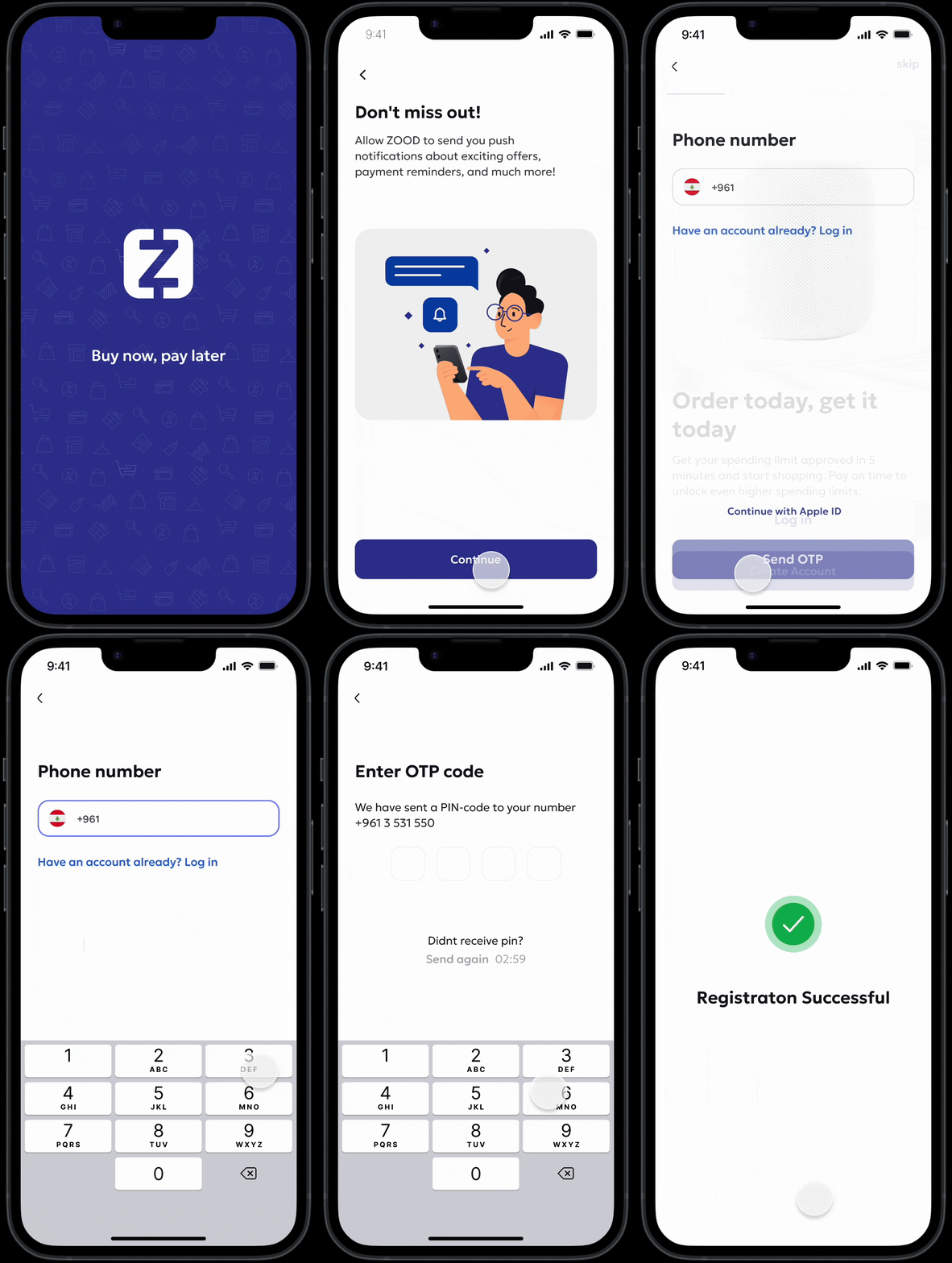
As part of our continuous effort to optimize onboarding and drive activation at ZOOD, we undertook a comprehensive revamp of the registration and activation flow for new users. This initiative focused on improving clarity, reducing cognitive load, and aligning the experience with our updated design system. The goal was twofold: streamline the onboarding process and maximize conversion from registration to activation.
As part of our continuous effort to optimize onboarding and drive activation at ZOOD, we undertook a comprehensive revamp of the registration and activation flow for new users. This initiative focused on improving clarity, reducing cognitive load, and aligning the experience with our updated design system. The goal was twofold: streamline the onboarding process and maximize conversion from registration to activation.
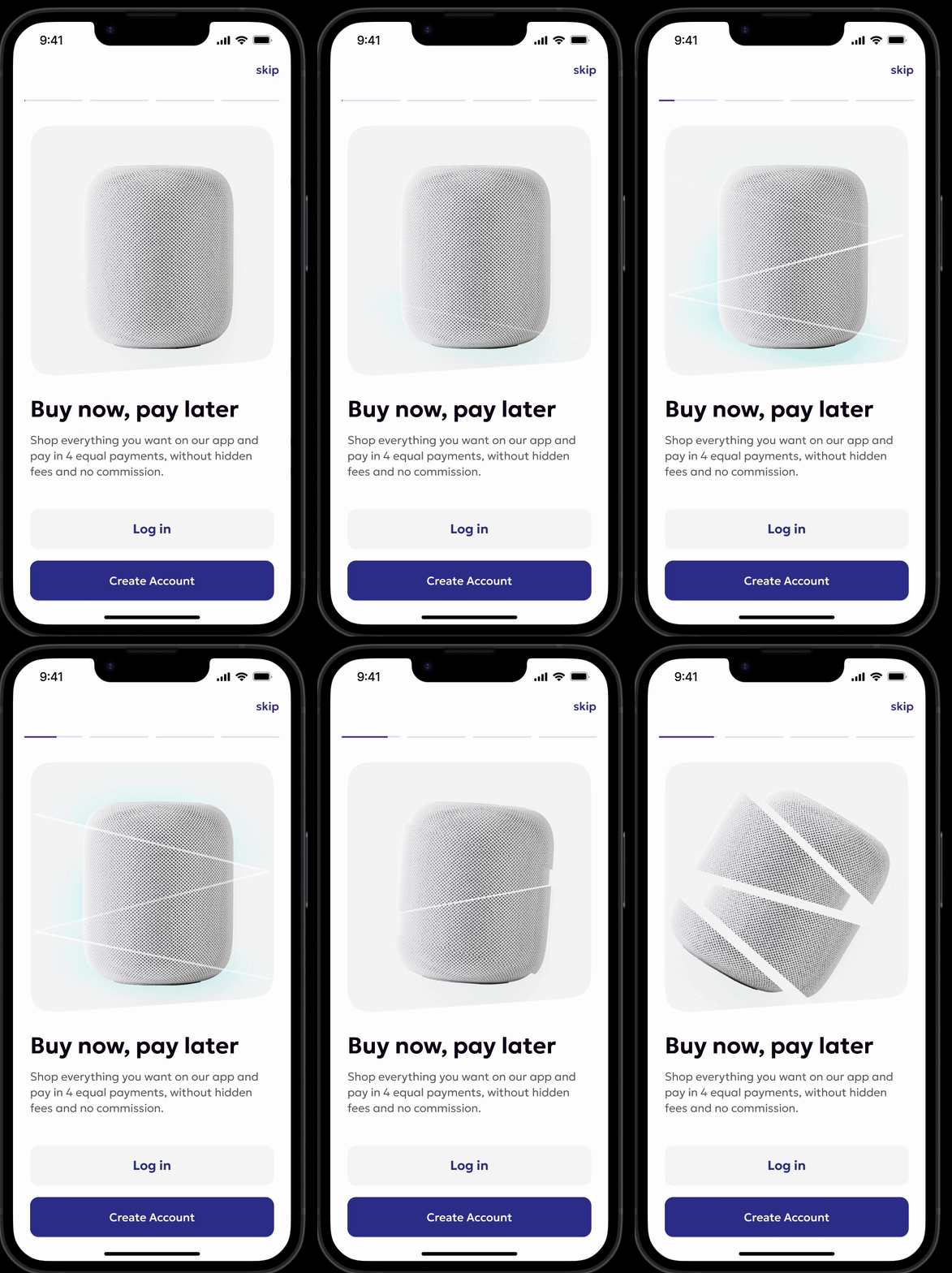
The first major focus area of the revamp was streamlining the registration experience to make it faster, clearer, and more engaging.
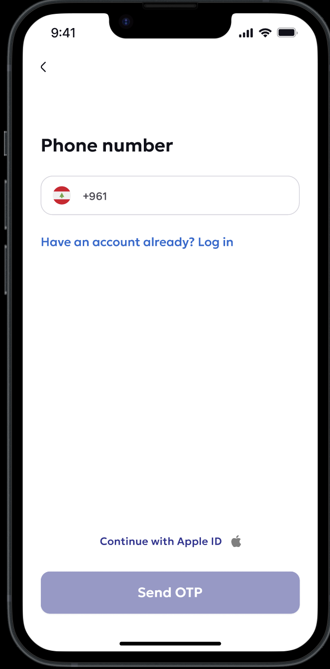
2. Phone Number–First Registration
To ensure consistency across our platform and improve backend reliability, we made it mandatory for all new users to register using their mobile phone number. This decision: Simplified authentication, Enabled better user tracking and verification, and Reduced support issues tied to email/social login inconsistencies.
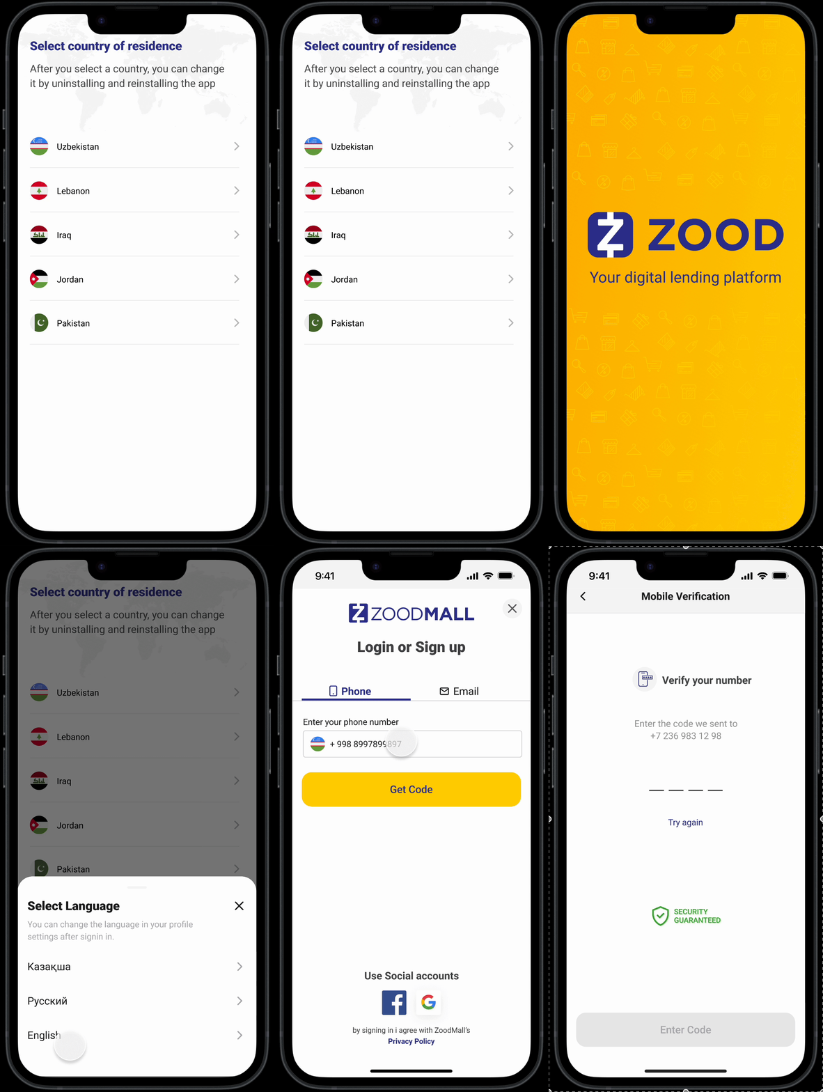
3. UI Enhancements:
We applied the new ZOOD design system to the registration flow, focusing on:Clearer input fields and real-time validation.Larger, mobile-friendly tap targets.Modern, consistent UI aligned with ZOOD's visual identity.These changes helped create a polished, low-friction experience that aligned with user expectations and mobile usability standards.
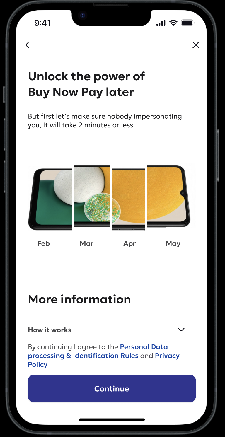
In a lend-tech product like ZOOD, the activation flow—the path from registration to receiving a credit limit—is one of the most business-critical journeys. Activation is not just a technical milestone; it directly correlates with user conversion, engagement, and revenue generation. Without a credit limit, users cannot transact, making this flow the gateway to profitability.
To address drop-offs and low activation rates, we redesigned the activation flow to be faster, clearer, and more intentionally structured to guide users toward taking action immediately after registration.
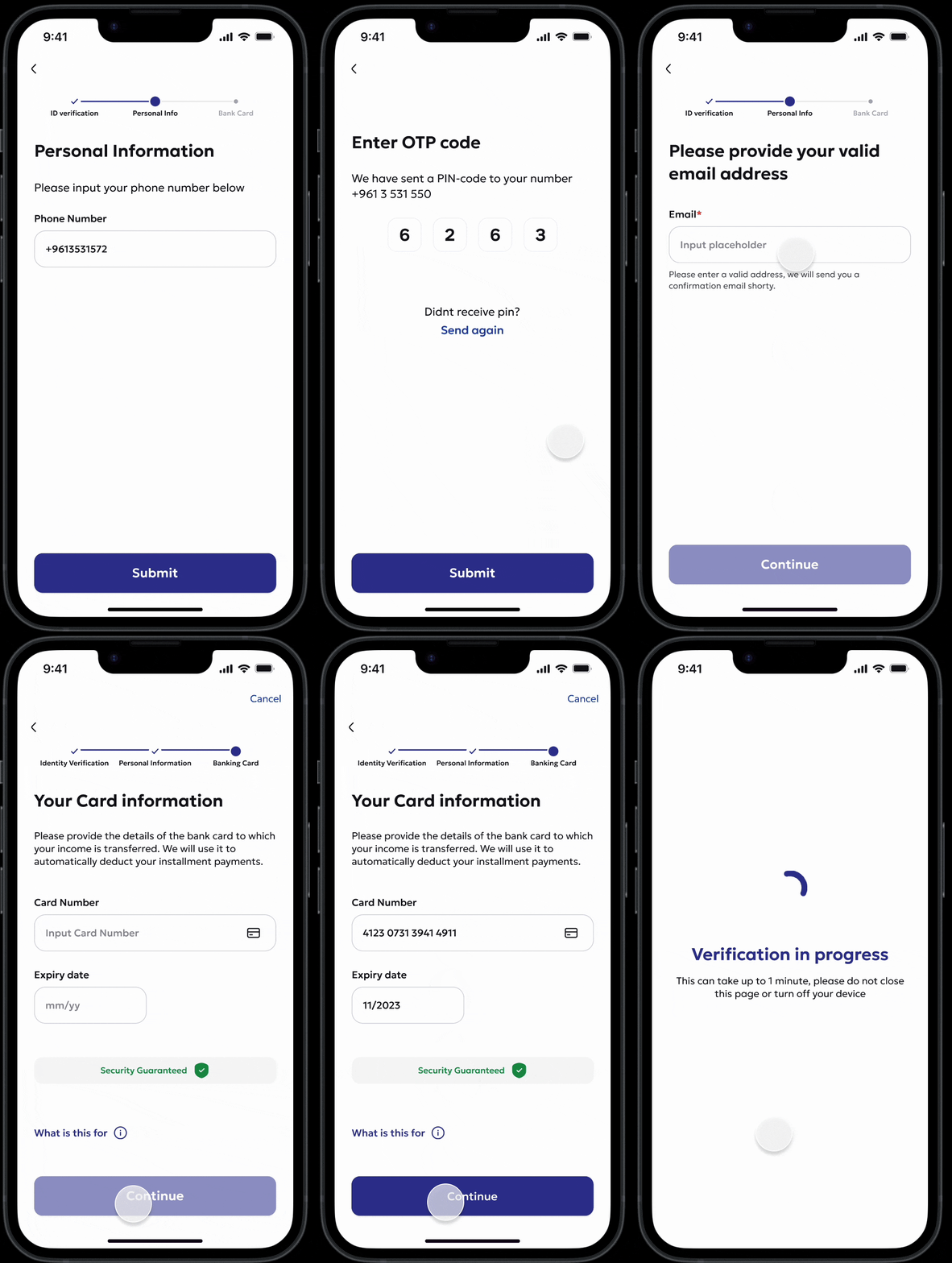
1. Step Counter for Progress Visibility:
We introduced a top-level step counter to give users clarity on how far they’ve progressed and how many steps remain. This reduced abandonment by setting clear expectations.
2. Reduced Actions per Step We broke down complex screens into smaller, focused steps—each requiring just one action. This minimized cognitive load and improved completion rates.
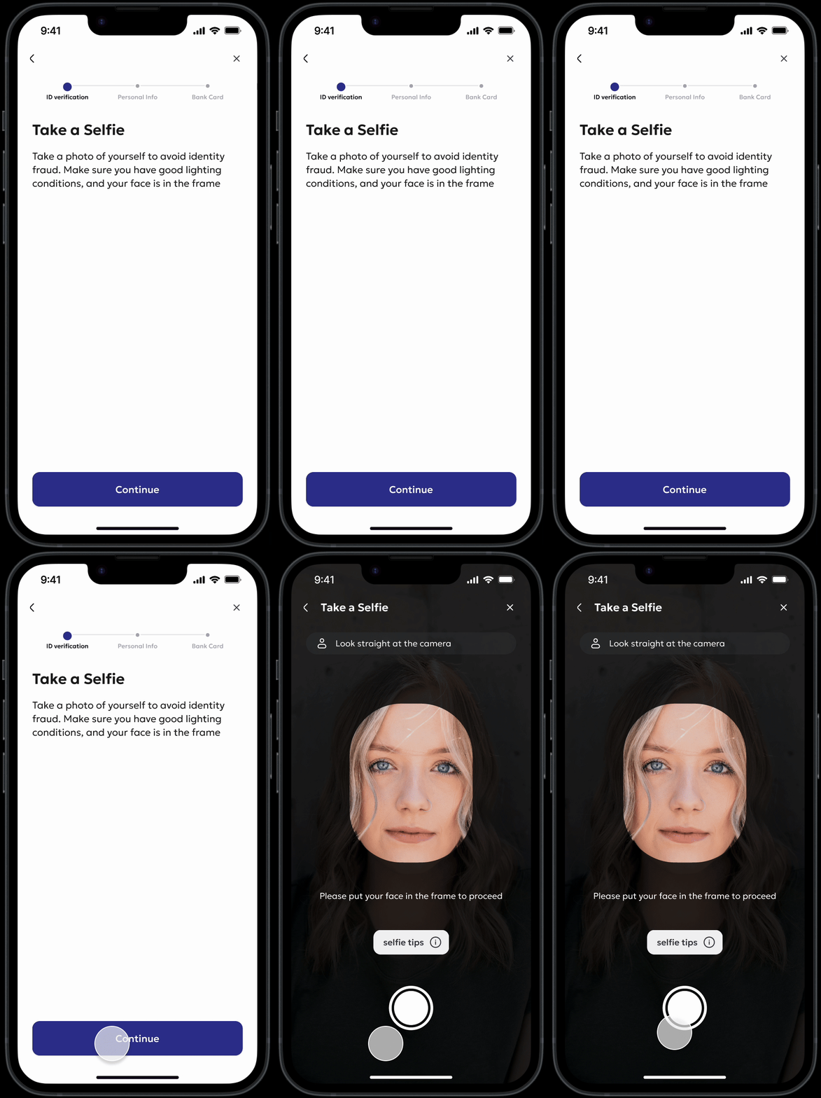
3. Enhanced Selfie Capture Guidance
The facial verification step was one of the most error-prone. We added contextual Selfie Tips with visual cues and instructions, which significantly improved the success rate on the first attempt.
4. Design System Integration We applied ZOOD’s updated design system across the flow to enhance UI clarity, consistency, and responsiveness. This improved usability, especially on lower-end Android devices.
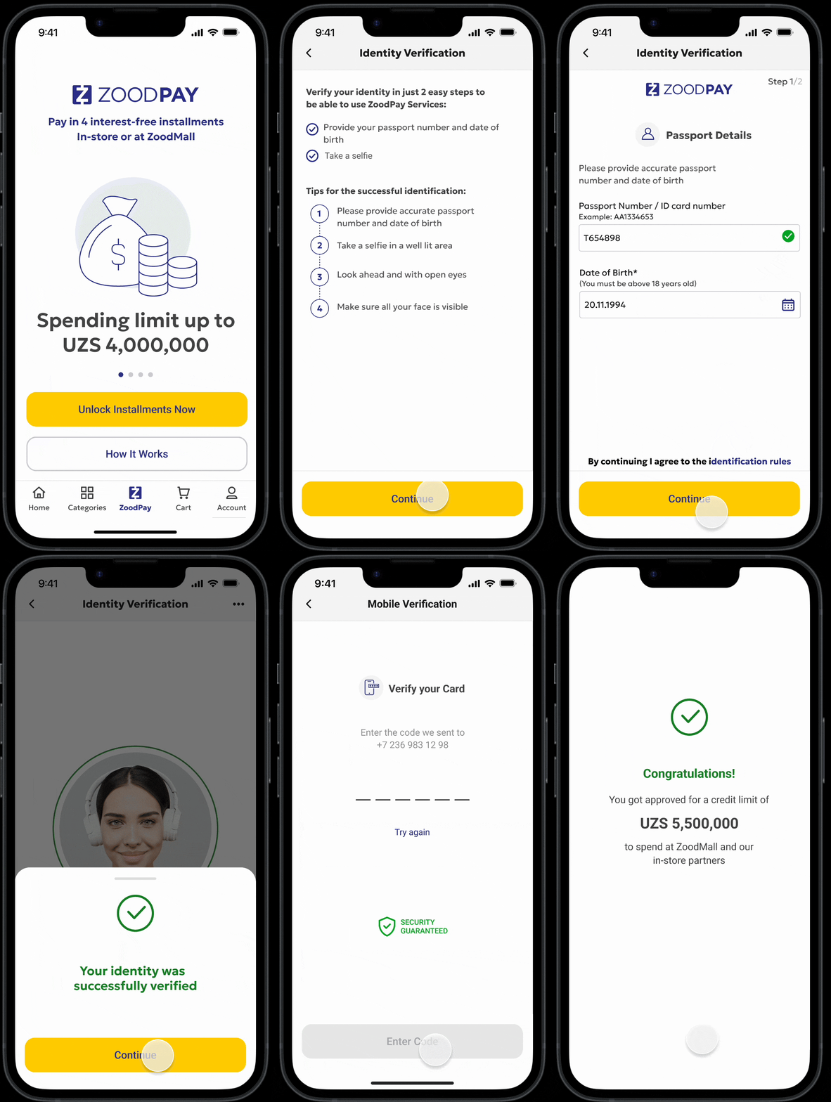


Previously, after completing registration, users were dropped directly into the homepage to browse the catalogue. While this seemed logical, it failed to prioritize the most important step—activating the user's credit limit.With the Golden Flow, we introduced a dedicated intercept screen immediately after registration. This screen explicitly encouraged users to proceed with activation and obtain their credit limit before browsing the app.
